
ECharts很强大,所以各种配置项和参数也超多,要想画出想要的效果,还真是一个细致活儿。在项目中使用echarts需要先 npm install echarts –save 或者直接下载js文件引入到项目中。
可以先在官网上用模拟数据调试好配置项,然后把options直接copy到项目里,刚开始不知道可以在官网上调试,耽误了好多时间。
这次画的曲线有一个特点:有促销和无促销的面积区域需要用颜色区分,有促销:橙色,无促销:灰色。
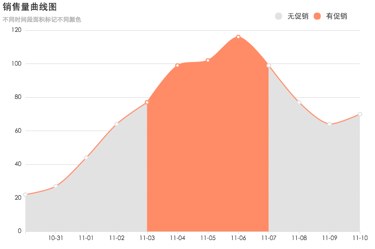
最终效果
代码
下面是在ECharts调试的代码,也可以到http://gallery.echartsjs.com/editor.html?c=xHJpzlHKQe查看
- 按照时间顺序和每天的状态status,将数据分割成多个series,每个series设置不同的areaStyle和itemStyle。
- 图例的颜色会与itemStyle.normal.color的颜色相同,例如这里有两个图例legend:有促销和无促销,它们的颜色对应series中有相同name的itemStyle.normal.color。
- 所以如果itemStyle.normal.color要求都是蓝色,图例就不能按需求展示有促销为橙色,无促销为灰色,而是展示的itemStyle.normal.color。
- 所以其实项目中的图例是我自己画的,并不是用的echarts的legend属性123456789101112131415161718192021222324252627282930313233343536373839404142434445464748495051525354555657585960616263646566676869707172737475767778798081828384858687888990919293949596979899100101102103104105106107108109110111112113114115116117118119120121122123124125126127128129130131132133134135136137138139140141142143144145146147148149150151152153154155156157158159// 数据 status为0表示这一天无促销,为1表示有促销var effectDTOList = [{ "date": "2016-10-30", "salesCnt": 22, "status": 0 },{ "date": "2016-10-31", "salesCnt": 27, "status": 0 },{ "date": "2016-11-01", "salesCnt": 44, "status": 0 },{ "date": "2016-11-02", "salesCnt": 64, "status": 0 },{ "date": "2016-11-03", "salesCnt": 77, "status": 1 },{ "date": "2016-11-04", "salesCnt": 99, "status": 1 },{ "date": "2016-11-05", "salesCnt": 102, "status": 1 },{ "date": "2016-11-06", "salesCnt": 116, "status": 1 },{ "date": "2016-11-07", "salesCnt": 99, "status": 0 },{ "date": "2016-11-08", "salesCnt": 77, "status": 0 },{ "date": "2016-11-09", "salesCnt": 64, "status": 0 },{ "date": "2016-11-10", "salesCnt": 70, "status": 0 }];//准备数据源和配置项var xAxis = [], //x轴数据yAxis = [], //y轴数据data = [], //每个系列(series)图表数据,是个二维数组series = [],seriesItem;var st = effectDTOList[0].status;for (var i = 0; i < effectDTOList.length; i++) {var date = effectDTOList[i].date.substring(5);xAxis.push(date);yAxis.push(effectDTOList[i].salesCnt);data.push([date, effectDTOList[i].salesCnt]);if (st != effectDTOList[i].status || (i == effectDTOList.length - 1)) {var color = st == 1 ? '#ff8c66' : "#e2e2e2";var name1 = st == 1 ? '有促销' : "无促销";seriesItem = {name: name1,type: 'line',smooth: true,symbolSize: 7, //转折点的大小data: data,areaStyle: {normal: {color: color,opacity: 1}},lineStyle: { //曲线样式normal: {color: '#ff8c66'}},itemStyle: { //转折点的样式normal: {color: color,borderWidth: 2,borderType: 'solid'}}};series.push(seriesItem);data = [[date, effectDTOList[i].salesCnt]];st = effectDTOList[i].status;}}//配置项option = {grid: {left: '3%',right: '4%',bottom: '3%',containLabel: true},title: {text: '销售量曲线图',subtext: '不同时间段面积标记不同颜色'},legend: {right: 50,top: 20,data: [{name: '无促销',icon: 'circle',textStyle: {color: '#333',fontSize: '14'}}, {name: '有促销',icon: 'circle',textStyle: {color: '#333',fontSize: '14'}}]},//工具栏toolbox: {feature: {saveAsImage: {} //下载图片}},//缩放配置dataZoom: [{type: 'inside', //内嵌缩放,如鼠标滚轮滚动、两指滑动xAxisIndex: [0] //x轴可缩放}],tooltip: {trigger: 'axis',formatter: function(params) {for (let i = 0; i < params.length; i++) {if (params[i].value) {return params[i].value[1];}}return 'loading';},backgroundColor: '#ff6633',padding: [10],axisPointer: {lineStyle: {color: '#ddd'}}},xAxis: {axisTick: {show: true},type: 'category',boundaryGap: false,data: xAxis,axisLine: {lineStyle: {color: '#ddd'}},axisLabel: {textStyle: {color: '#333'}}},yAxis: {axisTick: {show: false},type: 'value',axisLine: {show: false},splitLine: {lineStyle: {color: '#ddd'}}},series: series};